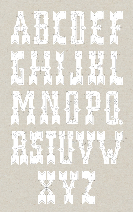
After viewing the font, I was curious to see her other work so I followed the link to her website. So glad I did. Austin, who "appreciates simplicity as long as it's compelling," has a very inspiring portfolio. I really enjoy her playful use of color and texture, as well as the modern-meets-mid century vibe that a lot of her pieces have.
Web design for the National Park Service -- this entire branding suite is great
A selection of Austin's logo designs
A selection of Austin's logo designs
Austin graduated in 2010 from the University of Minnesota and lives and works in Minneapolis. For being so young, she already has developed a great design philosophy and is definitely one to watch. I really like this little blurb from her biography:
I don't think branding (or anything for that matter) should ever compromise character and I believe quirkiness, a sense of humor & experimentation will always beat out the safe choice.
Amen to that. Like Austin, I try to use interesting typography treatments and meaningful shapes in my work as much as possible. But I've noticed lately that I tend to use the same colors: mustard, teal, and salmon.... I really should try using more orange and green, and take a cue from Austin and incorporate more texture in my work.
I hope you're inspired by Austin's work as much as I am. Added bonus: she has a great set of found typography on her Flickr!


2 comments:
Yep. Just looked at the whole portfolio and I'm blown away. I was just on lost type co-op and I can't believe I didn't click through to research more!
Great find!
This is very cool. I love to meet a young artist with a good philosophy! Because sometimes, it's just hard to articulate why we do what we do.
Post a Comment